Line Height and Weight
Line Height: the measure of space between lines.
Weight:
the weight of a typeface can also affect legibility. A very light typeface may
be difficult to distinguish from the background, while heavy strokes may make
letter shapes less distinct, especially at smaller sizes.
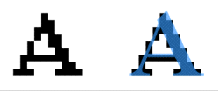
On the screen, we see text as pixel information. But type on paper has subtle curves that can only be approximated with Anti-Aliasing, which makes text look fuzzy.