Font Anatomy and Terminology:
Glossary of Type Terms
Typeface: This refers to the basic design, which is often extended to a family of faces (called styles in some systems) that are variants of the basic design, such as bold and italic.
Font: Technically, the set of characters contained in one member of a typeface family. In practice, however, the term is used indiscriminately to mean the face, a family or one member of a family.
Bitmap fonts: These are designed to appear on-screen in one size only, and they're optimized for viewing at that size. Bitmap fonts aren't used much today, as the more versatile outline fonts have taken over.
Outline fonts: These can be scaled to any size, remaining sharp and clear in very large sizes. The first outline fonts were developed by San Jose-based Adobe Systems Inc. for the PostScript system and were called Type 1 fonts. Later, Apple developed the TrueType format, which was subsequently adopted by Microsoft Corp. for use in Windows. And introduced with Windows 2000 was a new type of outline font called OpenType, which essentially replaces and subsumes both Type 1 and TrueType.
Character set: A font can have any number of characters in it. Some specialized symbol fonts might contain only a few characters, while others designed for multiple languages can have as many as 1,000 characters.
Double-byte characters: Many Asian languages, based on pictorial glyphs signifying words or concepts rather than letter alphabets, use tens of thousands of characters.
This creates obvious font problems that ASCII was never designed to handle. The most common way out of this dilemma involves allocating two bytes per character instead of one. This allows the computer to keep track of some 65,000 different symbols.
Glyph: This is the actual graphic representation of a single letter or symbol. Thus, the glyphs for the letter A in two fonts will be different, even though they represent the same character.
Kerning: Especially when used in large sizes, the horizontal spacing between individual letters must often be adjusted, or kerned. For example, look at the Ty in the headline of this QuickStudy. If normal spacing were used, these two letters would seem unnaturally far apart. By sliding the y underneath the top arm of the T, the visual spacing—how the eye perceives it—is made more even, and this lets the eye move more smoothly along the line of text.
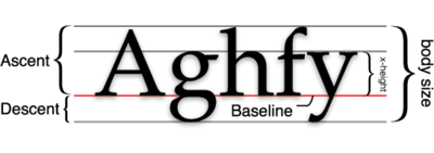
Point size: Type and fonts are measured in archaic units called points, one point being very close to 1/72 of an inch. Text (normal reading) sizes tend to run in the range of 8 to 12 points; the headline above measures 107 points in size.
What those points measure, however, isn't always obvious. It's not the height of the capital letters; it's the distance from the top of the highest part of, say, an f to the bottom of the lowest part of, say, a g.
Type design: Explaining the design and all the elements of a typeface is beyond the scope of this page, but if you're interested in learning more, I suggest Robert Bringhurst's The Elements of Typographic Style (Hartley & Marks, 1997).
There are many classification schemes for letter design, but the major ones you need to know are serif (letters with little "feet" on them, like the ones you're reading now) and sans serif (more geometric and usually plainer, like the paragraph headings in this glossary). Many other classes exist for decorative or historical reasons.
Unicode: Computers once dealt with just 128 characters for letters, numbers and symbols—the ASCII set. It took a lot of software contortions to use a language with multiple accents and diacritical marks (as in languages such as Polish or Romanian) or even a totally different alphabet (such as the Russian language's Cyrillic alphabet). Character sets were expanded to 256 and beyond, but this didn't solve the problem very well.
Unicode is a new standard for fonts, a kind of "super-ASCII" framework that allows 65,000 characters in a single font, with mechanisms for easily changing from one subset to another. It's been around for a few years, but little has been done with it.
Basic Anatomy
|
Serifs and Sans-serif
| Sans-serif font |  |
| Serif font |  |
| Serif font (serifs highlighted in red) |
 |
Basically to get fonts to show up you either:
a. use images/graphics of
text using the font that you want.
-You can use text saved as gifs, jpgs, png or swf.
-Problem: this makes larger files, and increases download time exponentially.
-Problem: Flash files are smaller, using vector type, but theyneed the plug-in
for
users to see. Also Flash has some problems with anti-aliasing being difficult
to turn off. And you can't print flash text or copy it without programming that
into the Flash file.
b. Or you actually write
out the text in the html and choose a font likely to be on a users system.
-fonts that are standard on most systems are easiest to use in terms of managing
changes in your text on your site.
-You can specify any TrueType font (PC) and Type 1 font with the font tag, and
then add in alternatives in case the user doesn't have your font.